Never Alone: Ki Edition
Adapting an award-winning indie video game for mobile devices.
My first project at E-Line Media was to adapt the BAFTA-award winning game Never Alone (2014) for iOS and Android.
Project Length
December 2015 to June 2016
My Role
UX Design Lead, User Research and Testing
Background
Never Alone is a beautiful puzzle platformer about an Iñupiaq girl named Nuna and her Arctic fox. It follows their adventures as they set out to save Nuna's village from a disastrous blizzard. It was first released on PC, Mac, and consoles in 2014 and was produced in close partnership with the Cook Inlet Tribal Council of Alaska.
Goals
Despite finding critical success after 2014, Never Alone came with its share of problems, including confusing level designs, poor controls, and insufficient onboarding. In a time frame of just over 6 months, E-Line asked me how they could fix Never Alone's most critical issues and unlock the mobile market.
User Research

"What am I supposed to be doing?" Twitch streamer BlossomingSun, playing Never Alone
Lacking user data from the original release of Never Alone, I conducted research into Twitch and "Let's Play" videos of people playing the game, noting the most common complaints, criticisms, and pain points:
Three Major Areas of Pain in Never Alone (2014)
- Poor Visual Clues
- Confusing Level Design
- Inconsistent AI
Improving Never Alone's Core Gameplay
Armed with user research data, I worked with the rest of the design team to generate ideas about how to improve the core gameplay of Never Alone.
Hint System
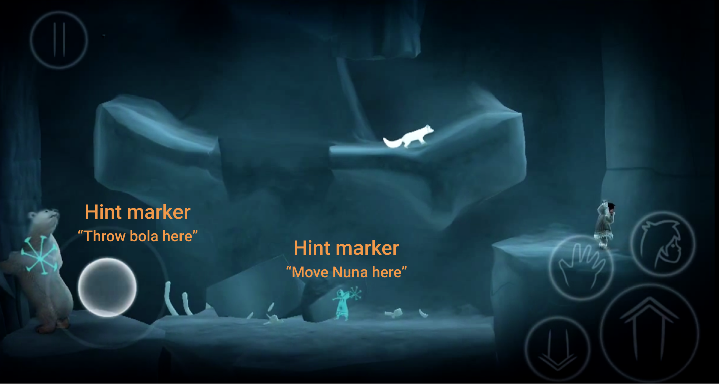
A tailored approach, providing the player with timed clues about how to proceed, where to go, and what to do, whenever the level design and visual language were insufficient.
Level design & graphical fixes
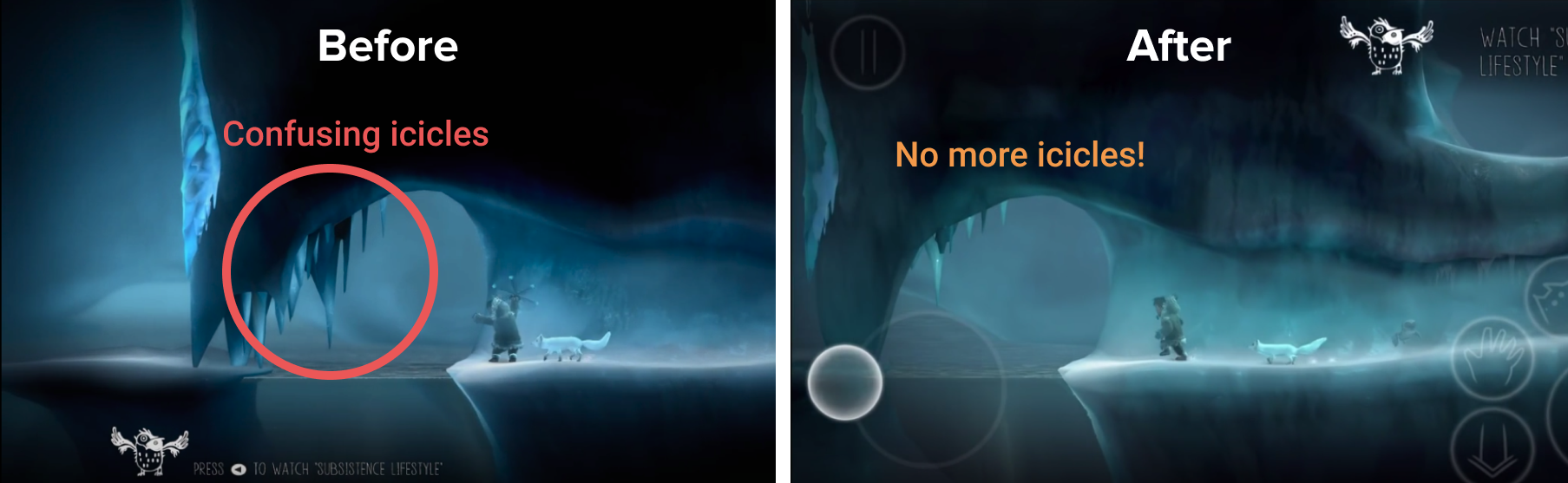
By changing elements of the level layouts and making adjustments to art assets, we hoped to highlight solutions and make pathways more clear to the player.
AI behavior tweaks
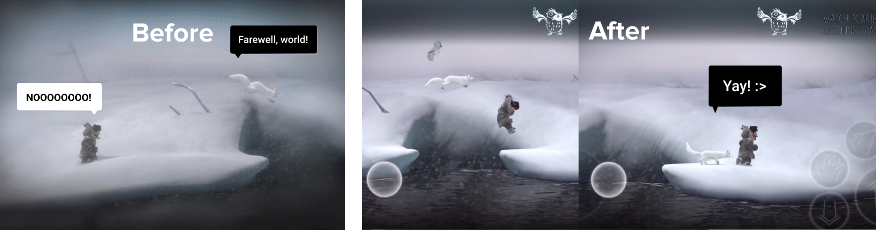
There were numerous complaints online about the game's AI behavior--specifically Fox, who is supposed to follow and support the player character, but who would often jump to his own death or behave unpredictably. We identified where these moments occurred and adjusted the AI behavior to match user expectations more closely.
Menu Redesign
To elevate Never Alone above vanilla port standards, the user experience needed to be clear, touch efficient, and in keeping with mobile trends.
Old Menu
Although the default PC and console menu UI was serviceable, when adapted to mobile devices, it became a critical usability issue.

- Unreadable Fonts
The default font (DK Lampion) was unreadable at smaller sizes, weaker brightness levels, and on lower screen resolutions.
- Tedious to use
The " < > " arrow buttons also proved difficult to tap for most of our users, requiring on average at least 2 tries, resulting in high inaccuracy and tedium.
- No mobile design language
The default menu simply lacked many of the common touch and mobile metaphors that users expect, like buttons or swipe gestures. This led to a feeling of being out of touch with our intended audience.
Solution: New Interaction Patterns and Information Architecture
I worked closely with E-Line's art director to design a new menu that was mobile appropriate, aesthetically in tune with the minimalist feel of the game, and efficient to use.
Our final design was based on my Sketch mockups and the interactive behaviors and information architecture I had outlined in our proposal.
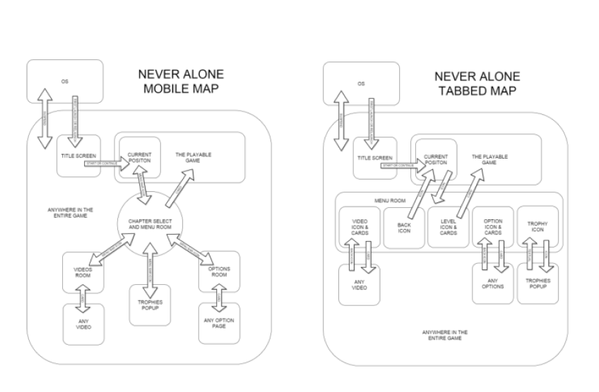
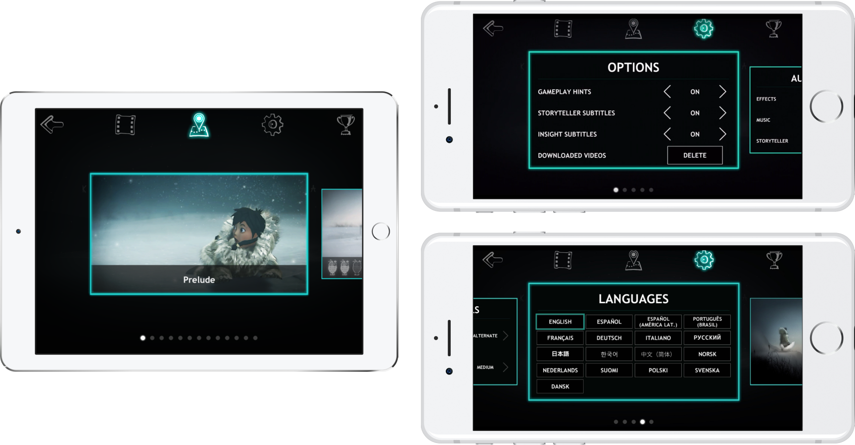
New Menu UI
The new menu was a significant improvement and offered a number of features that were minimal, easy to use, and mobile-friendly.
- Carousel design All of the menu content was displayed as "cards" in the carousel, breaking up the text into clear, organized, and easily scannable chunks.
- Mobile gestures A simple swipe gesture would move through content. Tapping on a card would allow you to select that content (e.g. launching a video, jumping to a level, changing a gameplay setting).
- Easy navigation A fixed navigation bar at the top of the screen would allow switching between menu areas (e.g. return to game; cultural insight videos; settings; achievements).
Touch Control Redesign
Initially, we contracted a third-party vendor to adapt Never Alone's control scheme to mobile. Unfortunately, the result was clumsy and difficult to use.
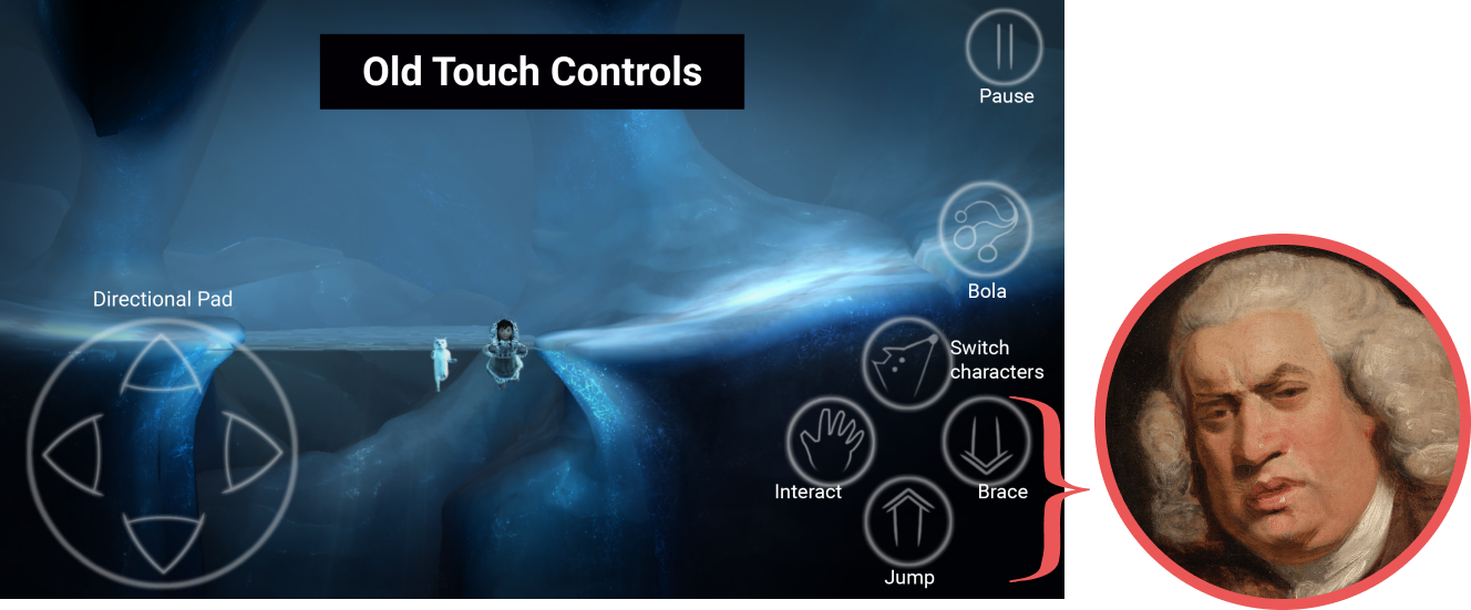
Pain Points
1. Inaccurate
In playtests, users struggled to accurately hit the action buttons due to their small size. The four-arrow D-pad also made it difficult to perform precise movements because it lacked nuanced movement.
2. Sensitivity issues
Many users also stated that the controls felt "too sensitive" and complained about the player characters falling off ledges too easily.
3. Did not match user mental models
Never Alone is a platformer game, which demands a lot of jumping during gameplay. Unfortunately, the default placement of the Jump button (UP arrow) was often confused with the Brace button (DOWN arrow), because users expected Jump to be positioned above Brace. Due to this confusing arrangement in a high thumb-traffic area, many users kept hitting Brace when they intended to Jump.
Solution: Controls Based on Primary Actions
After watching dozens of players make input errors with our third-party controls, I set about to redesign the controls entirely.
For inspiration, I looked at the Gamecube controller and Monster Hunter Freedom Unite's iOS control layout. Both featured an analog stick and oversized primary action button surrounded by peripheral buttons for secondary actions. I designed several control layouts based on these principles for maximum usability and comfort.
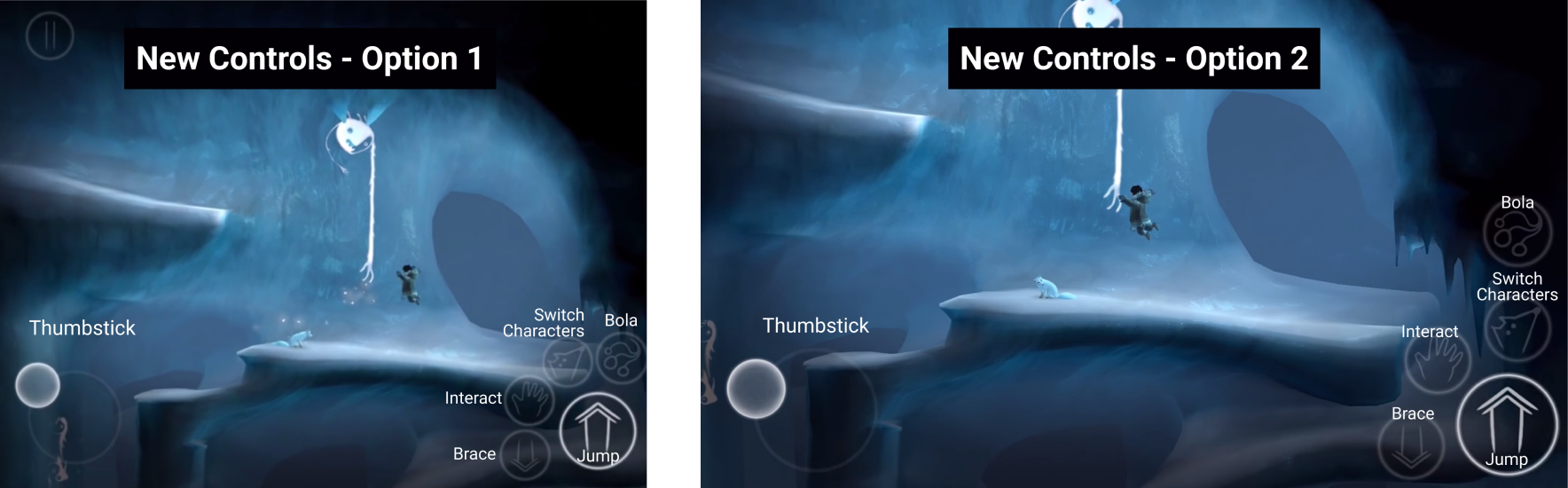
New Touch Controls
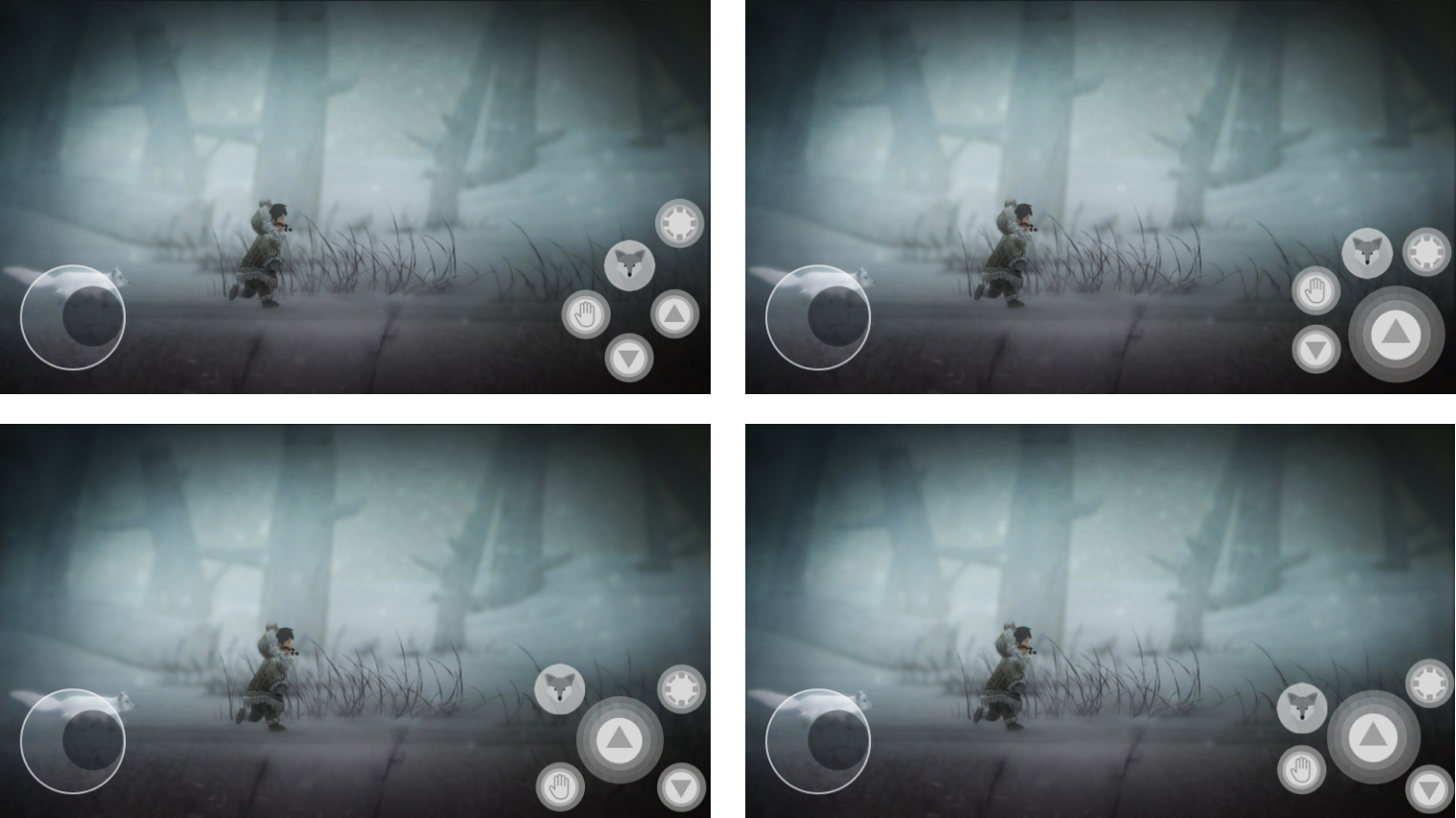
Radial Layout
To address player needs for a logically positioned Jump button, I designed a radial layout where Jump occupied most of the thumb-traffic area in the lower right corner of the screen, with the Brace button on the outer left, visually below and out of the way of Jump. I placed the other buttons equal distances outside of the Jump button in easy reach.
Thumbstick
I replaced the inaccurate D-Pad with a "thumbstick", an onscreen joystick that replicates the movements of console analog sticks. By sliding the thumb across the screen, players could gradually progress from walking to running, and vice versa. This would allow for more precise movements and hopefully alleviate the sensitivity problem that users were experiencing in our playtests.
In the final game, we offered two button layouts (seen above) to accommodate different player needs.
User Testing
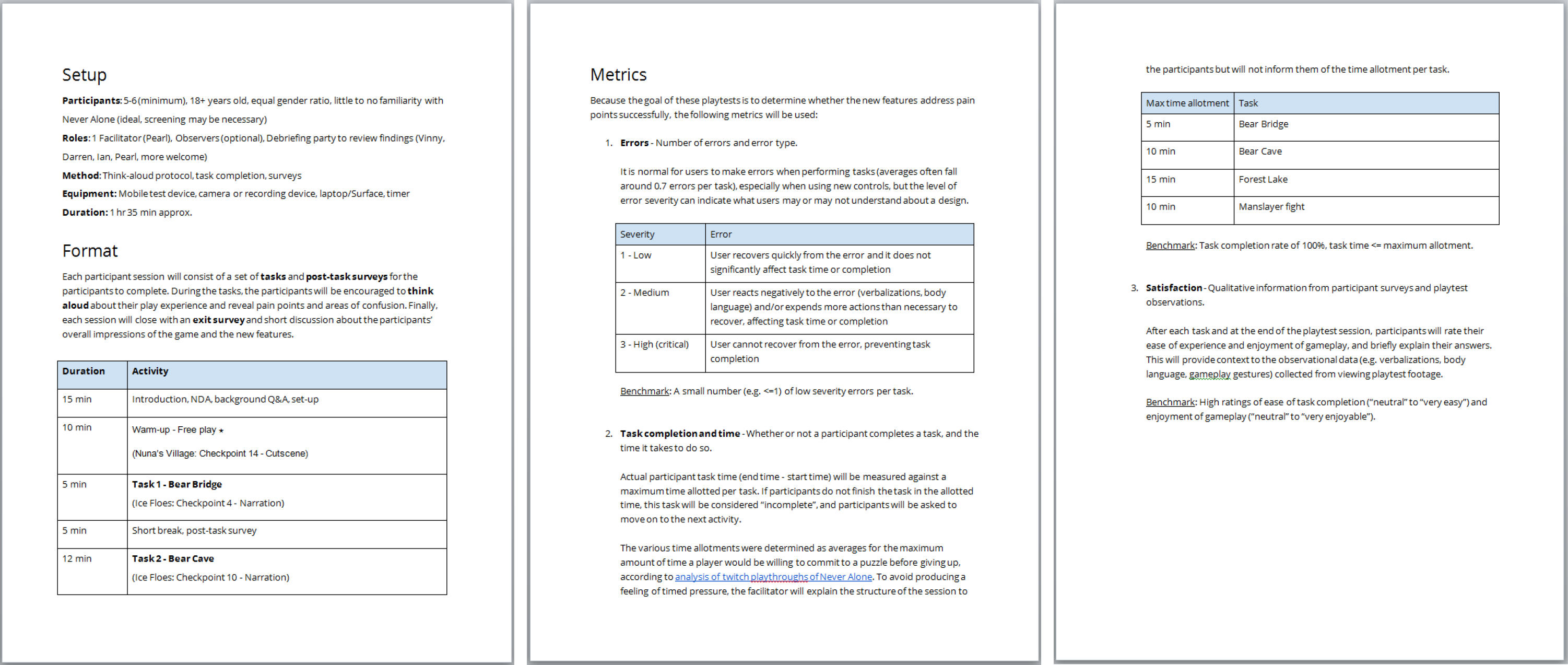
To validate all of our fixes, I designed a user playtest plan, including surveys, task-based assessments, and usability metrics. For 8 weeks during the development cycle, we tested our assumptions with real users. I moderated all of the tests and brought in different team members to observe--designers, programmers, and QA--which helped round out the perspectives and inspire inquiries.
Test Results
The menu UI was a success. It worked as intended and gave Never Alone a mobile facelift, and users had no difficulty understanding and navigating through it.
The redesigned buttons led to a dramatic improvement in play performance. In playtests, users made far fewer errors when using the new button layouts, and in surveys almost all thought that the radial buttons felt comfortable to use.
The thumbstick was imperfect but generally good. Skin-to-screen friction and the game's sensitivity settings did not always work in favor of the thumbstick. Overall, however, user tests revealed that most people had no problem using the thumbstick, and it did allow more nuanced movements.
Impact
Featured more than 80 times on iTunes as an Editor's Choice game. Over 50k downloads with a 4.4/5 rating on iTunes and 4.6/5 on Google Play.
Never Alone: Ki Edition has since been very well received critically and is highly rated in app stores. It exceeded expectations and reviews for it have been more favorable than reviews for the original 2014 release.
The development process was not always easy and plenty of things went awry, but I'm very proud of Never Alone: Ki Edition and of my work with E-Line that brought it there.
Reviews
We’re in awe at how deeply Never Alone pulled us into its unique tale of survival and exploration. At its core, the game’s a fun puzzle-platformer with stirring visuals and music.
But the way it pairs the mythic story of Nuna and her fox companion with short videos about Alaska Native culture gives everything greater impact. As fascinated as we already were by elements like spirit helpers, learning their significance made the whole experience more powerful. iTunes Editor's Choice
I highly recommend giving Never Alone: Ki Edition a try if you’re a fan of amazing storytelling, like learning about different cultures, and just want a great puzzle-platformer game.
A beautiful achievement developed in cooperation with indigenous folk that offers players valuable SEL skill building and a respectful window into Inupiat culture, ways of life, traditions, and stories.
It all adds up to create an actual memorable experience on iOS with compelling platformer gameplay, well presented Arctic atmosphere, and in-depth story extras.